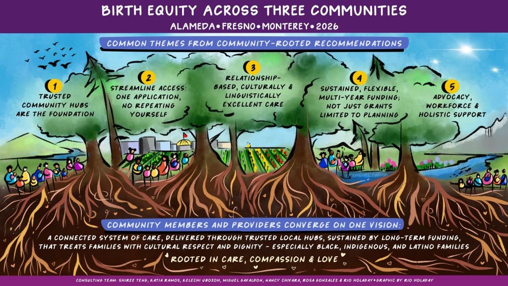
Today the Packard Foundation introduced a new visual identity, including a new logomark, color palette, and graphic elements including patterns, textures, and symbols. Together with our design partners, Barretto-Co., we have created a visual aesthetic that reflects our new strategic framework. Our new visual identity emphasizes the interconnectedness of our approach to achieving a just and equitable world where people and nature flourish.
The Foundation’s new logomark draws inspirations from our local natural environment and the concept of a ‘weave,’ and serves as a metaphor for interconnected ideas and collaborative efforts. During the design process, we took inspiration from horizontal ocean waves intersecting with vertical forests. The weave reflects a fabric of support and, ultimately, a resilient and beautiful tapestry.
“In our ever-changing world, the wellbeing of people and nature are intricately entwined,” said Nancy Lindborg, President and CEO. “Just as individual threads come together to form a strong fabric, people and communities unite to achieve enduring solutions.”
The logomark also weaves together the shapes and hues found in our natural surroundings — sagebrush green evokes the abundant earth, marigold reflects the coastal valley hills, and poppy orange pays homage to the California sunsets over the Pacific Ocean. We brightened and expanded our color palette to reflect Northern California’s natural beauty found in our ocean, mountains, and everywhere in between. Together the colors communicate harmony, joy, optimism, and a distinctly U.S. West Coast ethos.
Woven fabrics are an expression of a community’s history, values, and traditions, igniting curiosity and fostering a deep appreciation for people and their cultures. They play a critical role in various aspects of daily life and are rich in symbolism, colors, and unique motifs. We created bespoke woven patterns in which each thread contributes to the strength, durability, and integrity of the whole.
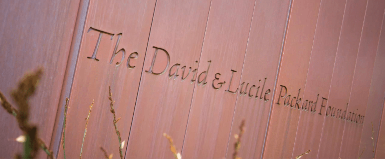
The new font used in our refreshed logotype leverages and pays tribute to the typeface etched into the exterior facade of our net zero energy and LEED® Platinum headquarters. It welcomes visitors to our physical space and pays tribute to our founders, David and Lucile, and their shared passion that has driven six decades of innovation and impact for people and nature.
“Our new aesthetic remains true to the 60-year legacy of the Foundation and illustrates our belief in the power and potential of people coming together to weave creative solutions to complex problems,” said Julie Packard, Vice Chair of the Board of Trustees. “Our visual identity is grounded in our West Coast presence and a design that reflects the vibrant colors and natural beauty of the landscape around us.”
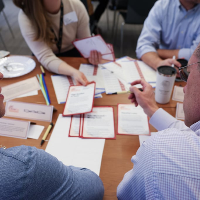
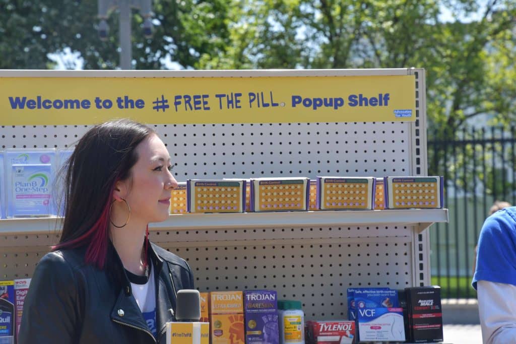
Our visual identity is expressed in a new, dynamic website that is the result of a collaboration with Visceral, our web development partners. The new website shares the story of the Foundation, our work, and highlights the innovative leaders and organizations addressing urgent problems that threaten people and the planet.